There’s a flood of cool wrapping paper on the market today. A simple home printer and ordinary kraft packing paper can be all you need...well almost.
Kraft paper is a good choice for home printers, because it already has a rustic lack-luster look to it. Often times with home printers, color prints aren’t as vibrant as one would hope. After you’ve created or found artwork, you need to
use graphic design software, in particular layout software to print the way you want on your home printer.
An alternative are the tons of savvy blogs or sites (heard of pinterest) today with free pdfs that you can print directly from!
 |
DIY KRAFT WRAPPING PAPER
|
Graphic design is fun. There are many aspects that push you to experiment and improve on. The world of graphic design splits itself into many facets. The one that I focus my attention on is stationery design. I specialize in letterpress, because it gives me leverage on “my baby” in terms of the final print outcome.
There are times when it won’t work for your client, because money is a factor or the sensory qualities aren’t important. Letterpress can be expensive because of the machinery, competence and other craft tools involved.
If you can’t afford to buy it or make it, don’t let it stop you from exploring!
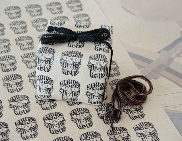
For the wrapping paper in the foreground, I
found a photographic image of guy with a cool typographic skull tattoo,
brought it into photoshop, selected what I wanted then
opened it up my layout program. Otherwise you can
illustrate an image in Illustrator, like I did in the background image of of a bike. It was
originally a photograph that I copied and colored in Illustrator.
Another alternative is to do one by hand and scan it at a good resolution depending on medium.
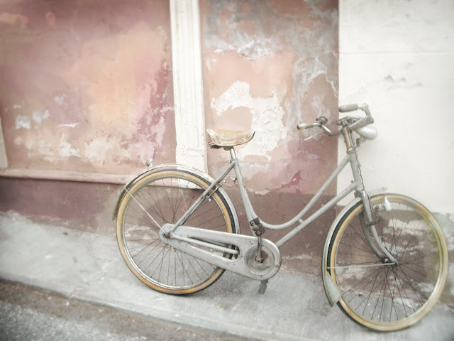 |
| VINTAGE BIKE, Italian Sidewalks |
In Indesign, I
copied and pasted the skull image to create a textured background. After a few test prints, I got alignment just right.
A tricky thing with home printers is that they “hiccup” or “skip a beat”. Meaning, there
maybe more margin off to one side and that’s why a layout program is crucial--in particular if you have an allover image.
An alternative is to use one typographic element or motif, it shouldn’t be as difficult to compensate for that hiccup. For a final touch,
why not wrap it up in a shoe string or something else slightly unconventional to personalize it?

